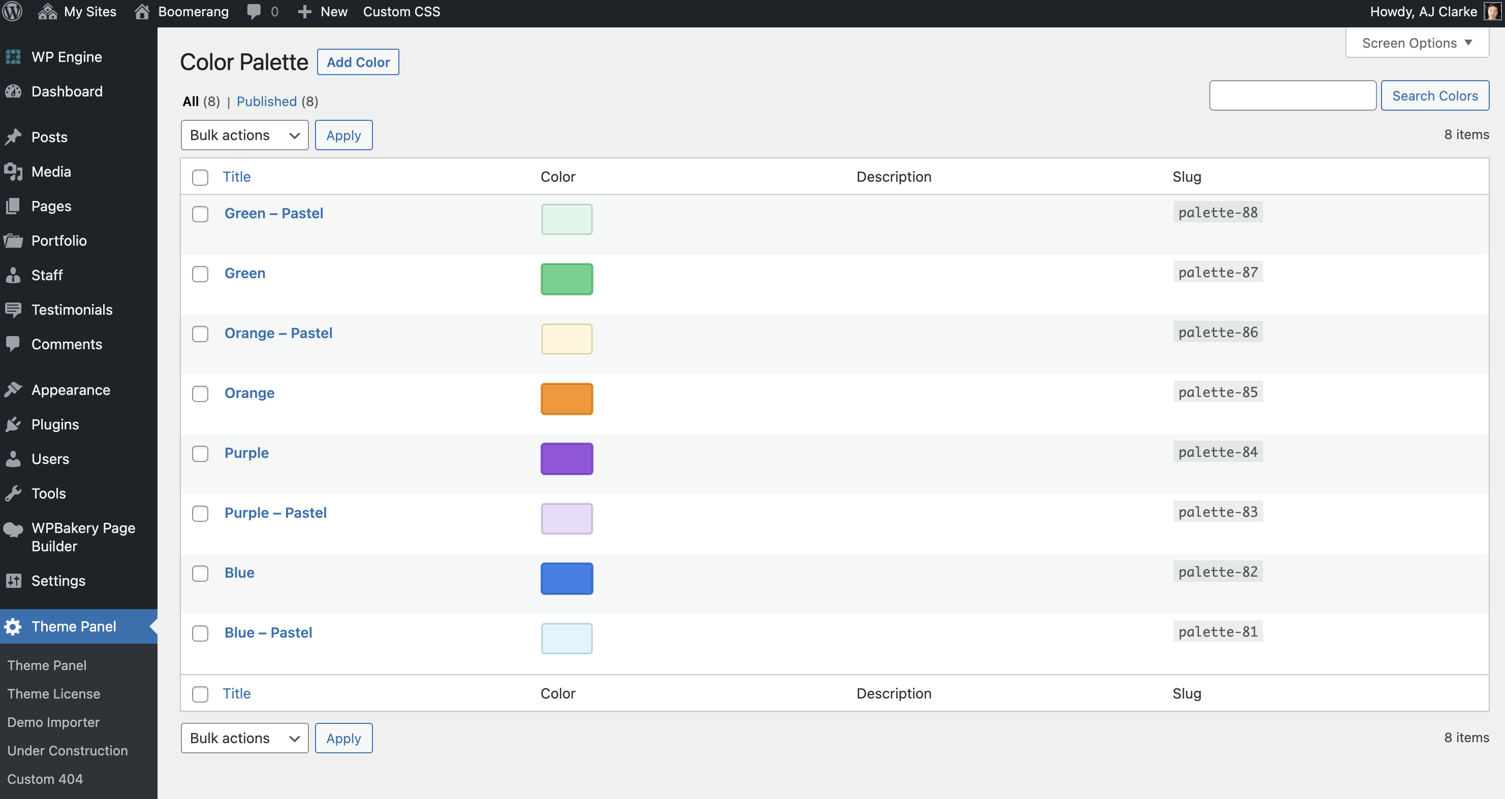
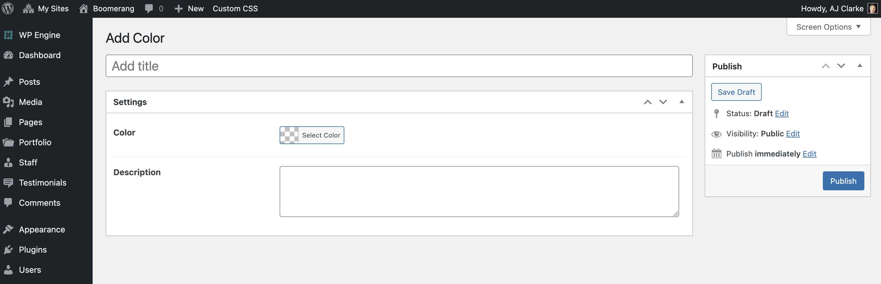
The Total Theme includes a Color Palette functionality to make it easier to define a set color scheme to use in your builder elements so you can easily control the colors globally. Simply go to to define and manage your colors.
Helper Developer Classes & Gutenberg Support
The theme provides automatic support for Gutenberg for your custom colors via helper classes which you can also make use of in any development. So every color you define 2 classnames on the front-end that can be used for adding the color as a background or text color:
- has-{slug}-color
- has-{slug}-background-color
Where the {slug} is the slug as shown on the main Color Palette admin page. So if you look up at the first screenshot on the page the classes would be “has-palette-88-color” and “has-palette-88-background-color”.
You can also find these classes in your site header when inspecting via the source code.
Palette CSS Variables
The theme also registers each of your colors as a a CSS variable that can be used in any custom CSS. The CSS variables use the following format:
- –wpex-{slug}-color
So let’s say if you are writing some custom CSS and want to apply one of your colors as a background to your element you could do so like so:
.element {
     background-color: var(--wpex-palette-14104-color);
}
Where “palette-14104” is your color slug.