Total includes a powerful function so you can easily tweak the widths of your site (main/content/sidebar) for all responsive sizes. All you need to do is go to Appearance -> Customize -> Layout to tweak your layouts and view the changes live.
- Container Width: Your site width (all content).
- Content Width: The area with the content when your left or right sidebar is enabled.
- Sidebar Width: Your sidebar width.
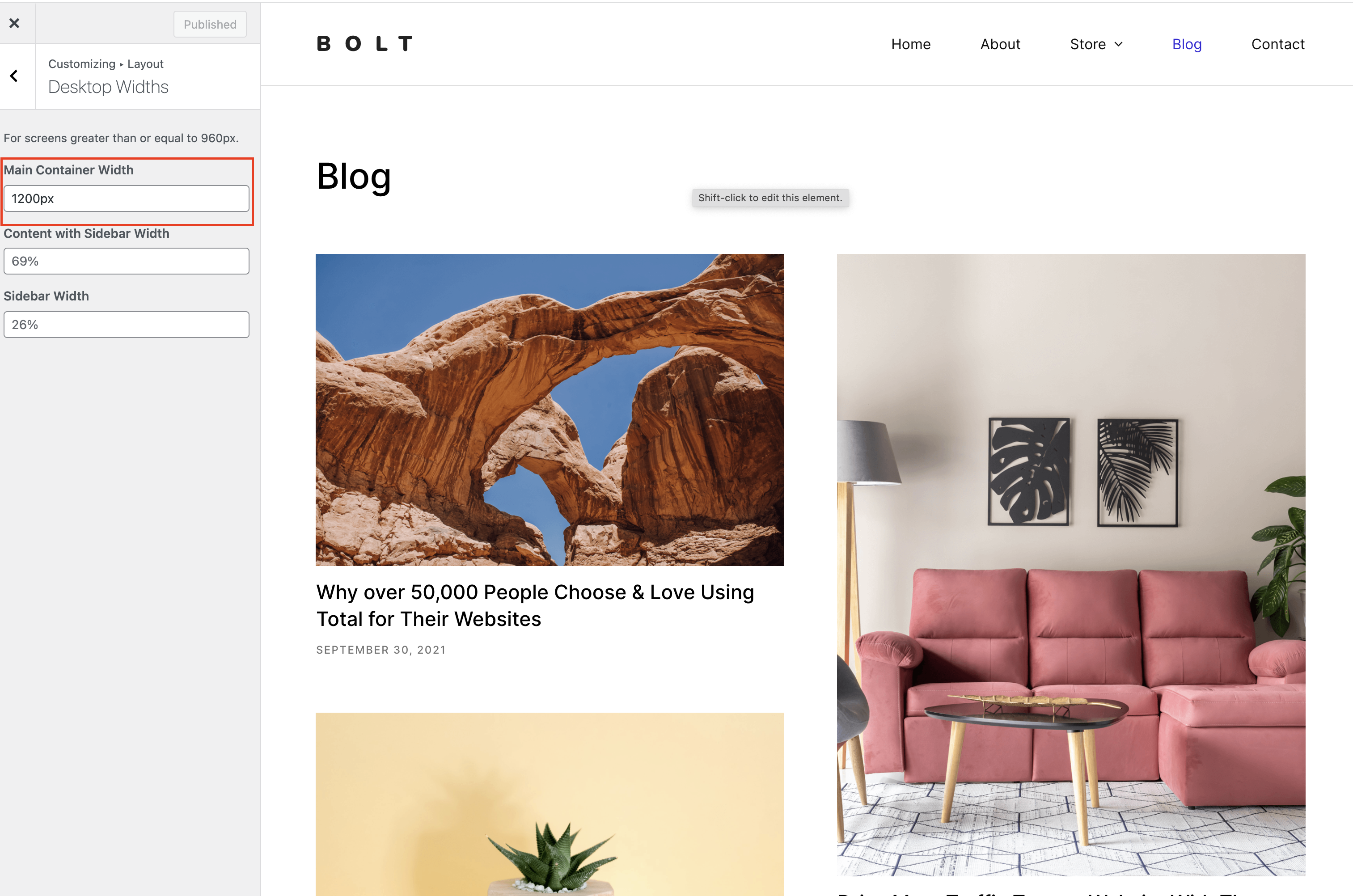
Container Width
This is the width of your site. You can use pixels or percentages for the value. There isn’t any max or minimum.
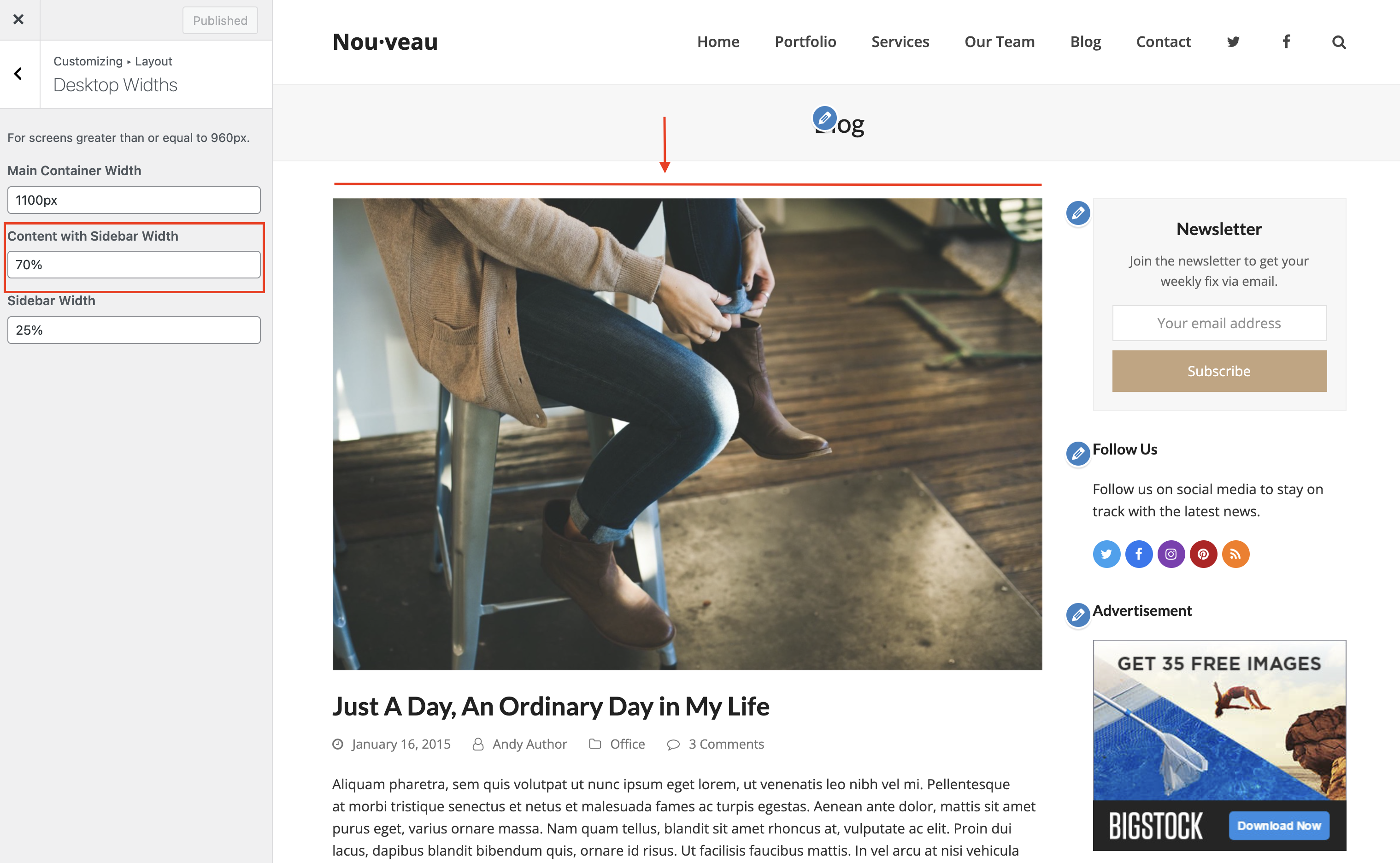
Content with Sidebar width
The content width Sidebar width option is used to define the width of your main content area when displayed with a sidebar next to it. The default value is 69% and using a percentage allows the site to have a fluid layout.
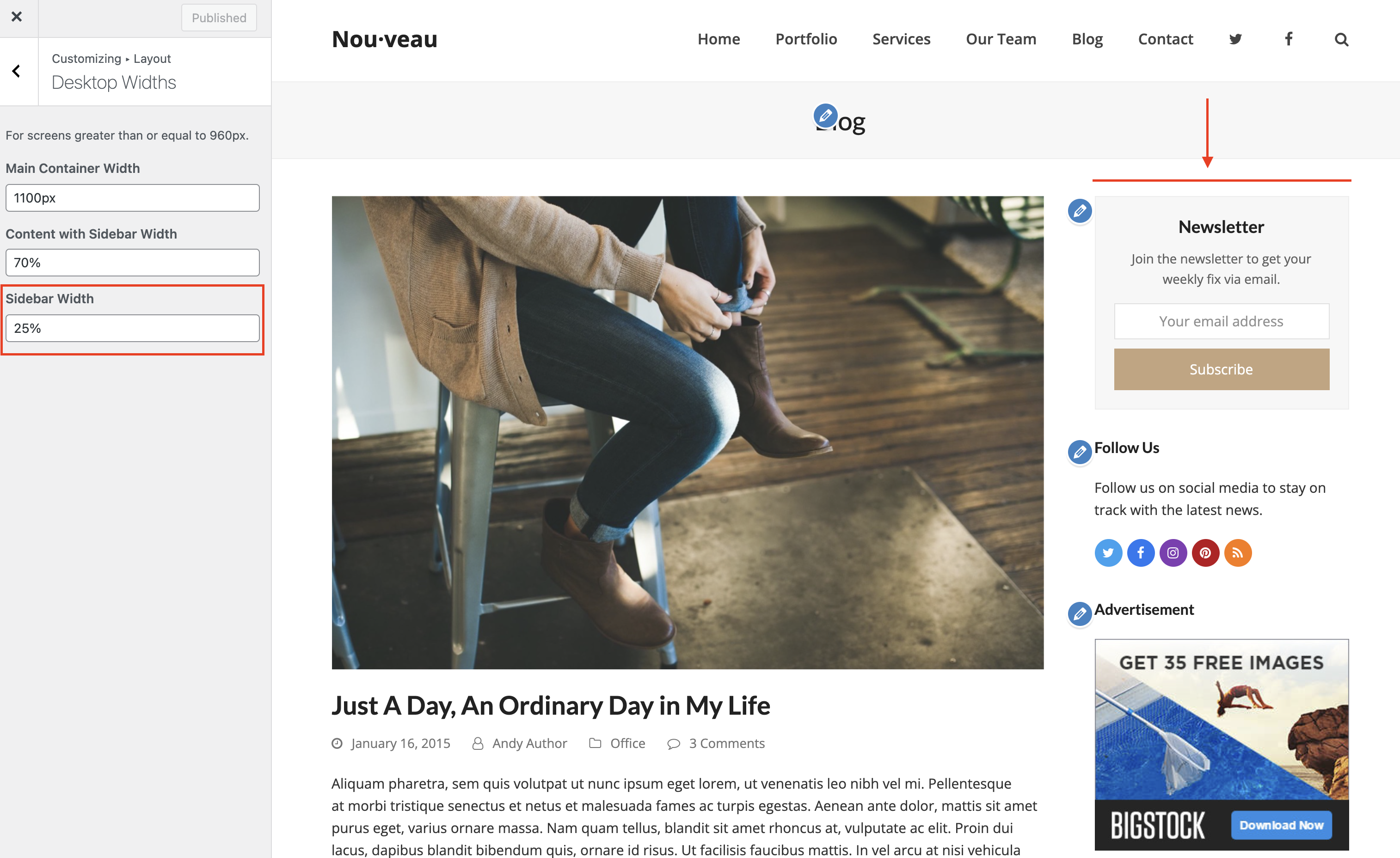
Sidebar Width
The Sidebar width of course is used to alter the width for your sidebar. The default value is 26% which is a percentage in order to have a fluid site design, but you can use a fixed pixel width for your sidebar if you want to maintain the same width for your sidebar across different screen sizes. If you want to use a fixed pixel make sure to use calc() for your content area width (see the next section for an example).
Using a Fixed Sidebar Width
By default the theme uses a percentage width for the content area and the sidebar for a fluid layout. However, if you wanted to have a fixed sidebar width that remains the same across all devices you can do this by setting your fixed sidebar width in pixels and then using the CSS calc() function for the content width. See example below:
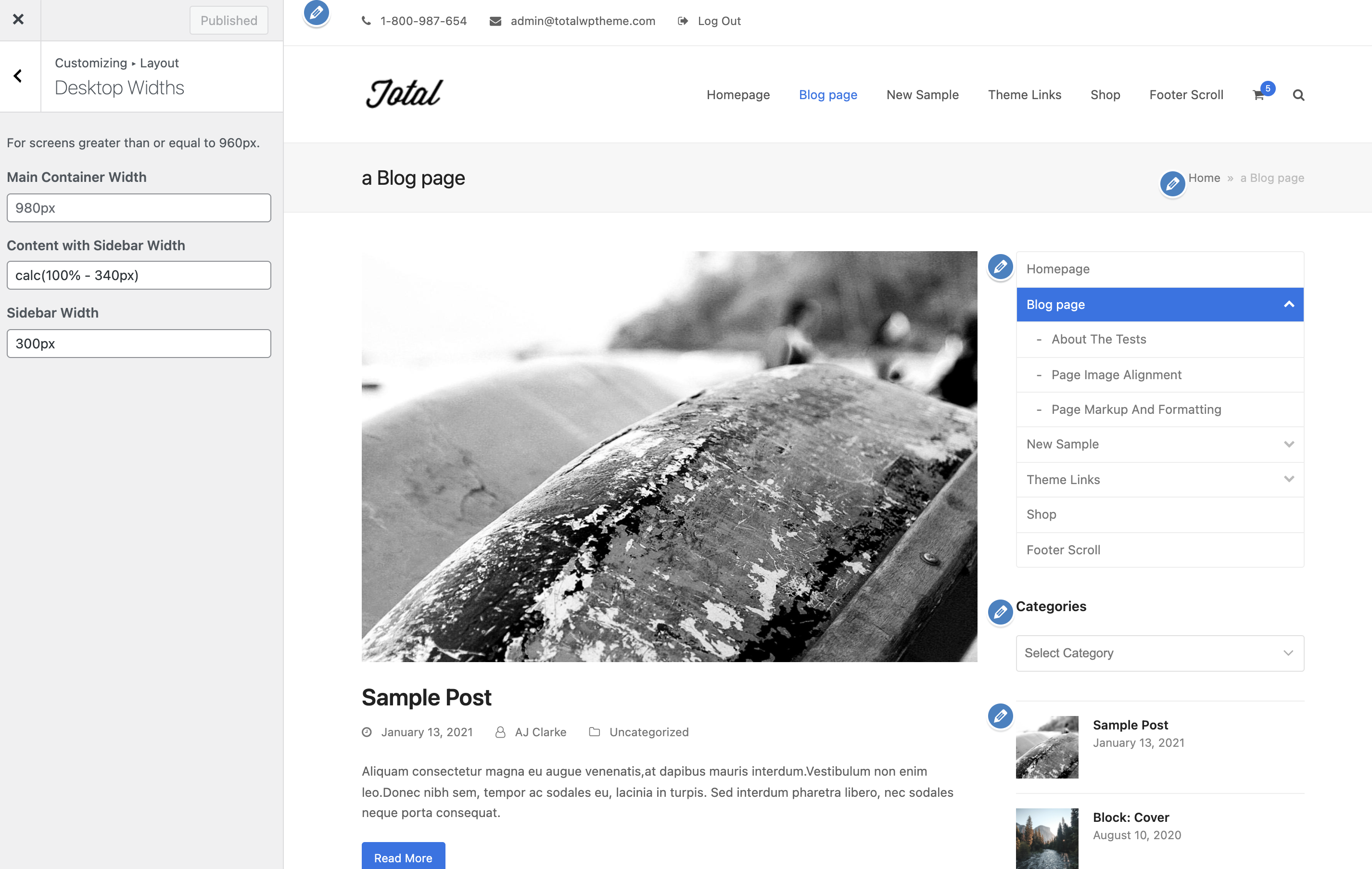
Notice how we used calc(100% – 340px) for the Content with Sidebar Width? This is because we want to subtract the width of the sidebar which is 300px and then add a 40px gap between the content and the sidebar.
The alternative would be to use a fixed pixel value for the width and ensure that your content area plus your sidebar are the same size or smaller than your container width. By using the CSS calc function you don’t have to do any math yourself and ensures the site is fully responsive!
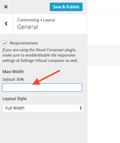
Max-Width
Since version 3.0.0 of Total the theme was changed to a fluid layout so there is a max with of 90% on the main container. This makes it so even if you set your layout to be 3000px wide it will never go past 90% of your window width so as you resize your browser your site content will always be visible. This can be altered at Appearance > Customize > Layout > General.