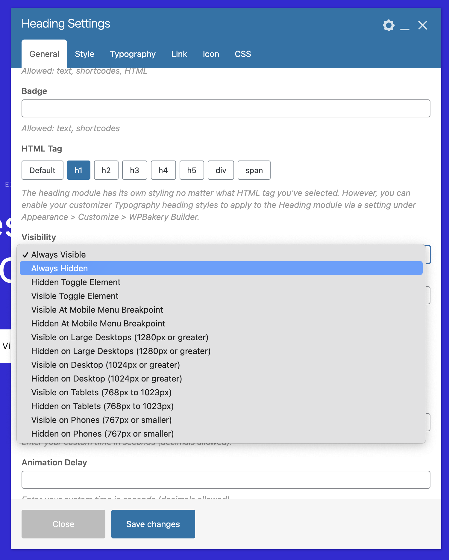
Total includes many useful classes for responsiveness so you can show/hide items. Core Total WPBakery modules and the WPBakery rows have settings built-in already to show/hide items but some modules may not have the built-in settings if they are core WPbakery modules or 3rd party modules. However you can still use the Total theme classes to show/hide them via the “Extra class name” field. Below is a list of all available classes and example usage:
- hidden – Always Hidden
- show-at-mm-breakpoint – Visible At Mobile Menu Breakpoint
- hide-at-mm-breakpoint – Hidden At Mobile Menu Breakpoint
- hidden-desktop-large – Hidden on Large Desktops (1280px or greater)
- hidden-desktop – Hidden on Desktop (1024px or greater)
- hidden-tablet – Hidden on Tablets (768px to 1023px)
- hidden-phone – Hidden on Phones (767px or smaller)
- visible-desktop-large – Visible on Large Desktops (1280px or greater)
- visible-desktop – Visible on Desktop (1024px or greater)
- visible-phone – Visible on Phones (767px or smaller)
- visible-tablet – Visible on Tablets (768px to 1023px)