As you may be aware the Total theme includes a CSS utility framework which is used for the majority of the theme’s styling to keep the code as slim and consistent as possible. Included in the utility framework are utility font sizes. These font sizes have defined values, but because they use CSS variables they can be easily adjusted to fit your needs.
Why Use Preset Font Sizes?
Before getting into how to use and modify the preset font sizes let’s first look at some reasons as to why you would want to use them and there are really only two reasons but they are very compelling:
- Consistency: Using the preset font sizes will create consistency across your site because you won’t just be adding random font-size numbers that you think look good. You don’t have to keep track of what pixel sizes you’ve used and where.
- Global Control: You can always change your font-sizes globally via the Customizer by modifying the preset font size values rather then manually editing elements via your page builder or gutenberg.
Using Preset Font Sizes in Theme Elements
If you are using WPBakery you can easily use the theme’s preset font sizes in different elements that have font size fields by simply clicking the links in the field description like in the screenshot below:
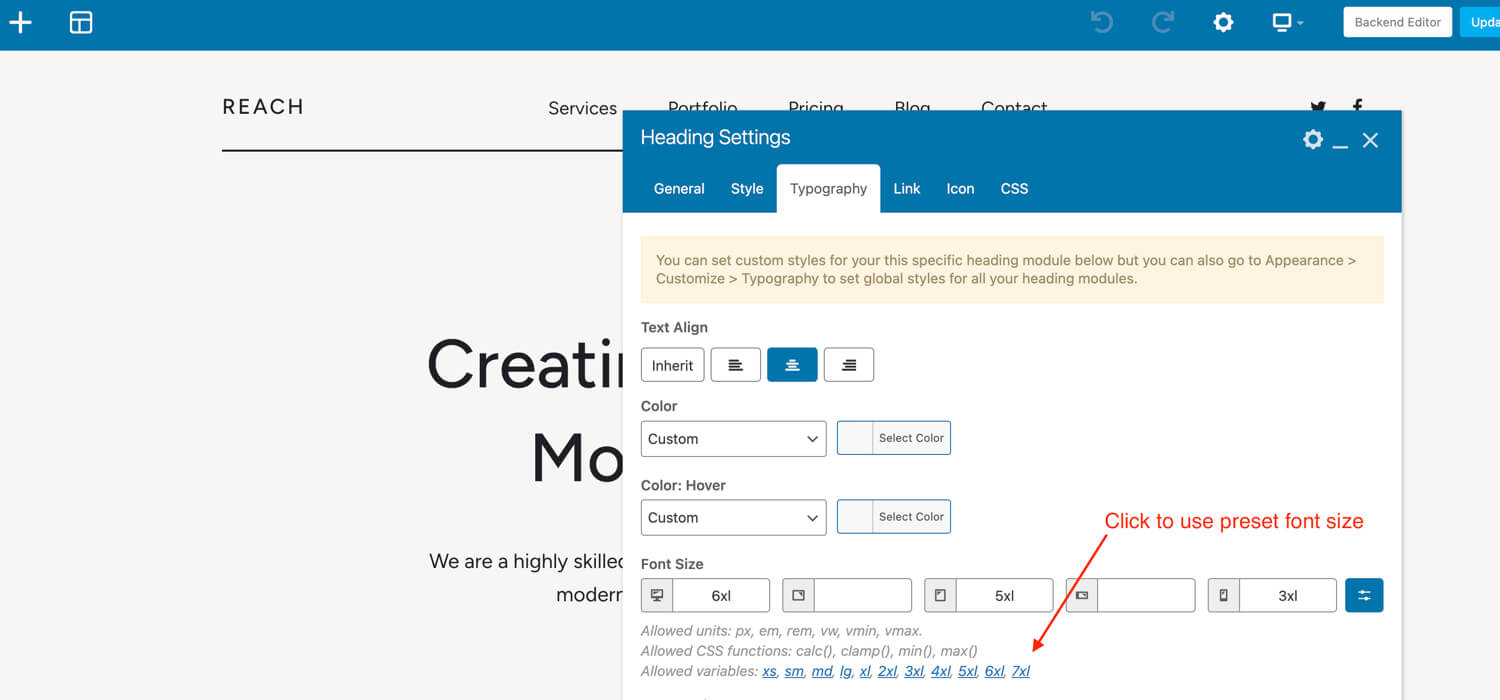
When you click on any of the preset font size variables you will notice that the same thing gets added to the field above and the names are consistent with the font size name.
If you are not using a theme element or WPBakery you can still use the theme’s preset/utility font sizes by using their classnames as defined in the docs.
How to Modify the Preset Font Sizes
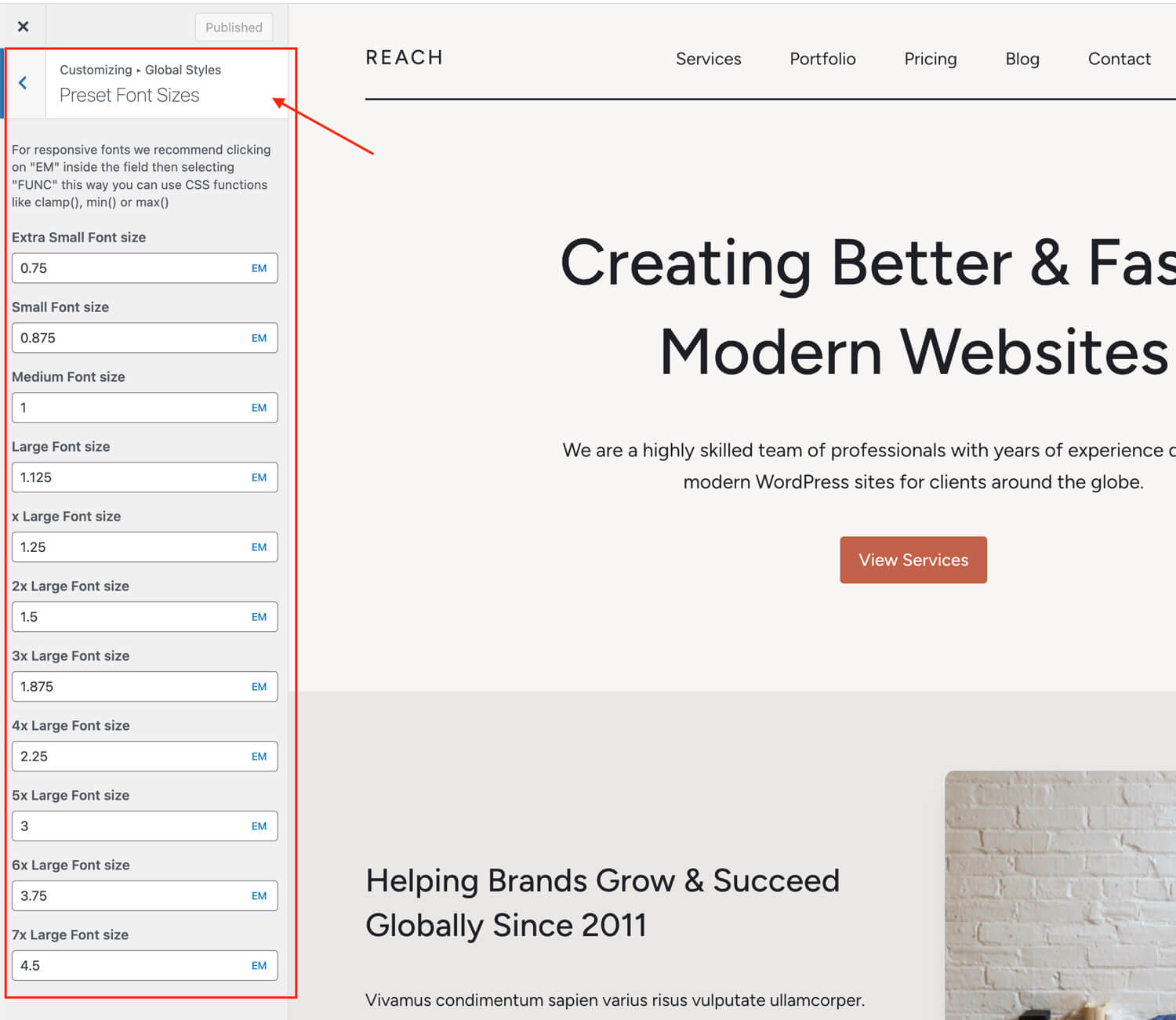
You can easily modify your preset font sizes via the Customizer by going to Global Styles > Preset Font Sizes.
Mobile Breakpoints
You may notice that these fields don’t have responsive options for adding a different size at each breakpoint. We’ve done this on purpose to keep things nice and slim.
If you want different font sizes on smaller screens we would recommend using EM values for your font sizes (the theme uses em values by default) then under Customize > Typopgraphy > Body you can set a larger font size on desktop and a smaller one on mobile, this way your em based font sizes will automatically adjust.
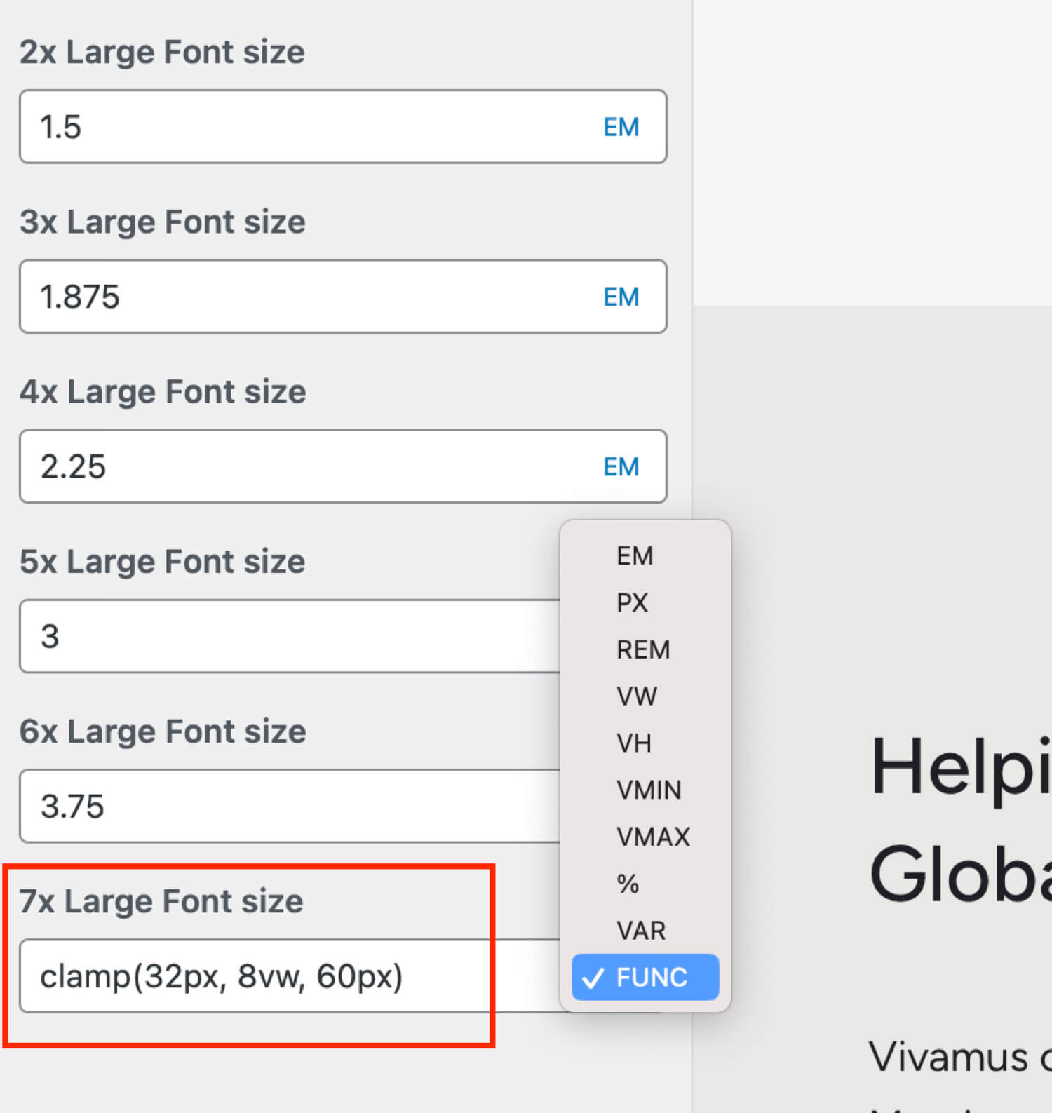
Large Fonts Auto Responsive Size
For your very large font sizes you may want to consider using an automatically responsive font size using the modern CSS clamp() function. To do this you would click on the “EM” icon and switch to “Func” then you can enter your CSS function. See the screenshot below: